


ComponentGPT
I help create frontend React components using design systems like Radix, Shadcn, Chakra UI, Mantine, and HTML with inline or Tailwind styling.
What does ComponentGPT do? (& its Use Cases)
ComponentGPT streamlines the creation of React components for developers and designers.
It transforms detailed prompts into coded components, offering design and styling flexibility.
For Frontend Developers
Speeds up UI development by generating code from descriptions.
For UI/UX Designers
Turns design concepts into functional React components effortlessly.
For Product Managers
Helps in prototyping products quickly and efficiently, bridging gaps between teams.
How to Use ComponentGPT?
Creat React components with ease by using ComponentGPT
Whether you're a seasoned developer or a designer dabbling in front-end work, this guide will walk you through the process of generating custom React components using a selection of design systems and styling methods. Let's dive in.
Step 1: Know Your Tools
Before we start, understand that ComponentGPT is your go-to for crafting React components. It uses Magic Patterns to turn your ideas into code. You have five design systems at your disposal: Radix Themes, Shadcn, Chakra UI, Mantine, and HTML. For styling, choose between Inline Styling and Tailwind. Remember, some combinations don’t mix, so choose wisely.
Step 2: Craft Your Prompt
Your prompt is the seed from which your component will grow. Be detailed. Describe the functionality, appearance, and any specific elements you want. Exclude the design system and styling method from your prompt; you’ll choose those in the next step. Think of this as briefing a highly skilled colleague who’s going to bring your vision to life.
Step 3: Select Your Design System and Styling Method
With your prompt ready, it’s time to choose your tools. Pick a design system and a styling method that align with your project's needs. Avoid the no-go combinations: Shadcn with Inline Styling, Mantine with Tailwind, and Radix Themes with Tailwind. Your choice should reflect your project's design philosophy and the technical ecosystem.
Step 4: Generate Your Component
Once you've prepared your prompt and selected your design system and styling, you're set to create your component. This is where I, ComponentGPT, come into play. Provide me with your prompt, design system, and styling choice. I’ll work with Magic Patterns to generate a URL that leads to your new component, complete with render, code, and an editor for further customizations.
Step 5: Customize and Implement
The URL you receive is your gateway to customization. Here, you can tweak the layout, styling, or functionality to perfect your component. This step is crucial for ensuring your component fits seamlessly into your project. Use the editor to make adjustments until you’re satisfied with the outcome.
Best Practices
- Be Descriptive in Your Prompt: The more details you provide, the closer the generated component will be to your vision.
- Understand Your Project's Needs: Choose a design system and styling method that best suits the technical and aesthetic requirements of your project.
- Iterate and Customize: Use the editor to refine the component. Don’t hesitate to regenerate the component if your requirements change significantly.
Troubleshooting
- Invalid Combination Error: If you’ve selected an incompatible design system and styling method, simply go back and choose a valid combination.
- Component Doesn’t Meet Expectations: Refine your prompt with more details or consider changing the design system or styling method for better alignment with your vision.
ComponentGPT's Testing Performance
ComponentGPT's Core Features
Prompt-Based Component Creation
Transforms detailed descriptions into React components, bridging the gap between idea and implementation without manual coding.
Design System Flexibility
Offers choice among Radix, Shadcn, Chakra UI, Mantine, and HTML, ensuring compatibility with diverse project aesthetics and functionality.
Styling Method Options
Supports Inline Styling and Tailwind, catering to different development preferences and project requirements for customization.
Customization Post-Creation
Generates a URL to an editable version of the component, allowing for easy adjustments and refinements to perfect the design.
Validation Against Invalid Combinations
Prevents selection of incompatible design system and styling method pairings, streamlining the creation process and avoiding errors.
Direct Integration with Magic Patterns
Leverages Magic Patterns API to instantly convert prompts into code, speeding up the development process and enhancing productivity.
FAQs from ComponentGPT
ComponentGPT's Prompt Examples
Creating UI Components
Design a responsive login form with email and password fields, a login button, and links for forgot password and sign-up.
Create a dashboard header component featuring a logo, navigation links, a search bar, and profile dropdown.
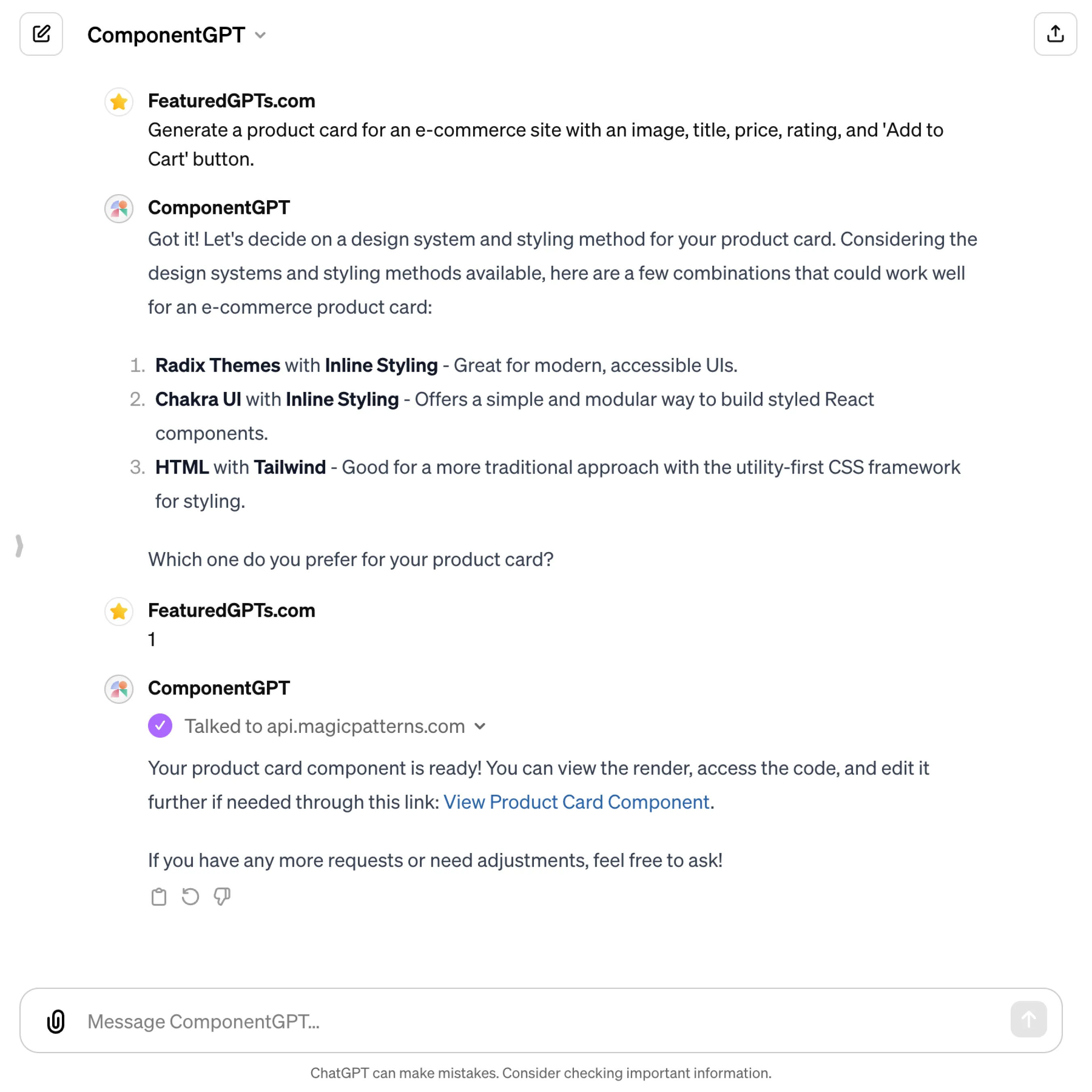
Generate a product card for an e-commerce site with an image, title, price, rating, and 'Add to Cart' button.
Building Form Elements
Design a multi-step signup form with progress bar, including user details, address information, and payment method steps.
Create a custom dropdown select component with searchable options and multi-select capability.
Generate a dynamic input field that auto-formats currency values as the user types, with validation for correct formatting.
Implementing Navigation Components
Design a sticky top navigation bar with dropdown menus for a multi-category website, responsive to mobile devices.
Create a vertical sidebar navigation with expandable sub-menu items for a dashboard application.
Generate a breadcrumb navigation component that dynamically updates based on the current page path.